Astro + Tailwind CSS v4: Setup, Theming & Dark Mode
How to use Tailwind CSS v4 with Astro: installation, the @theme config, custom fonts and colors, the typography plugin, and a dark mode toggle with no flash.
In this guide
- Introduction
- Step 1: Install Tailwind CSS
- Step 2: Import the Stylesheet in Your Layout
- Step 3: Customize Colors and Fonts With @theme
- Step 4: Style Markdown With the Typography Plugin
- Step 5: Add a Dark Mode Toggle
- Step 6: Organize Reusable Styles
- Common Problems and Fixes
- Skip the Setup: Start From a Theme
- Frequently Asked Questions
- Conclusion
Introduction
Tailwind CSS and Astro are one of the most popular pairings in modern web development, and every theme we build at Platoltheme uses them together. Tailwind CSS v4 changed how setup and configuration work: there is no more tailwind.config.js, and configuration now lives in your CSS. This guide shows how to set up Tailwind v4 in an Astro project, customize your design tokens, style Markdown content, and add a dark mode toggle that does not flash.
New to Astro? Read our beginner's guide to Astro first.
Step 1: Install Tailwind CSS
From the root of your Astro project, run:
npx astro add tailwind
On Astro 5.2 and later, this command:
- installs
tailwindcssand the official Vite plugin,@tailwindcss/vite - registers the plugin in
astro.config.mjs - creates
src/styles/global.csswith a single line:
@import "tailwindcss";
Your astro.config.mjs will look like this:
// astro.config.mjs
import { defineConfig } from 'astro/config';
import tailwindcss from '@tailwindcss/vite';

export default defineConfig({
  vite: {
    plugins: [tailwindcss()],
  },
});
Step 2: Import the Stylesheet in Your Layout
Tailwind only applies to pages that import the stylesheet. Import it once in your base layout, and every page that uses the layout gets it:
---
// src/layouts/Layout.astro
import '../styles/global.css';
---

<html lang="en">
  <head>
    <meta charset="utf-8" />
    <meta name="viewport" content="width=device-width, initial-scale=1" />
  </head>
  <body class="bg-white text-gray-900">
    <slot />
  </body>
</html>
Now you can use utility classes in any .astro component:
<h1 class="text-4xl font-bold tracking-tight md:text-6xl">Hello, Astro</h1>
Step 3: Customize Colors and Fonts With @theme
In Tailwind v4, your design tokens are CSS variables declared in an @theme block. Each variable automatically creates matching utilities:
/* src/styles/global.css */
@import "tailwindcss";

@theme {
  --color-brand: #6246ea;
  --color-brand-dark: #4a32c9;
  --font-display: "Clash Grotesk", sans-serif;
  --breakpoint-3xl: 120rem;
}
That gives you bg-brand, text-brand-dark, font-display, and a new 3xl: breakpoint, with no JavaScript config. Because tokens are plain CSS variables, you can also use them in custom CSS with var(--color-brand).
Using Astro's Fonts API with Tailwind: since Astro 6, you can load fonts with the built-in Fonts API and point a Tailwind font token at the CSS variable it creates:
// astro.config.mjs
import { defineConfig, fontProviders } from 'astro/config';
import tailwindcss from '@tailwindcss/vite';

export default defineConfig({
  fonts: [
    { name: 'Inter', cssVariable: '--font-inter', provider: fontProviders.fontsource() },
  ],
  vite: { plugins: [tailwindcss()] },
});
@theme {
  --font-sans: var(--font-inter), sans-serif;
}
Add <Font cssVariable="--font-inter" preload /> (imported from astro:assets) to your layout's head, and every font-sans element uses Inter with optimized fallbacks and no layout shift.
Step 4: Style Markdown With the Typography Plugin
Content from Markdown and MDX renders as plain HTML tags, which Tailwind's reset leaves unstyled. The official typography plugin fixes that:
npm install @tailwindcss/typography
/* src/styles/global.css */
@import "tailwindcss";
@plugin "@tailwindcss/typography";
Wrap your rendered content in the prose class:
<article class="prose prose-lg mx-auto dark:prose-invert">
  <Content />
</article>
Customize it with element modifiers, for example prose-a:text-brand prose-headings:font-display.
Step 5: Add a Dark Mode Toggle
By default, Tailwind's dark: variant follows the visitor's operating system setting. To let visitors choose, switch the variant to a class on the <html> element.
Make dark mode class-based
/* src/styles/global.css */
@import "tailwindcss";
@custom-variant dark (&:where(.dark, .dark *));
Now dark:bg-gray-950 applies whenever <html class="dark"> is set.
Set the class before the page paints
Add this inline script to your layout's <head>. The is:inline directive tells Astro to output it as-is, so it runs immediately and avoids a flash of the wrong theme:
<script is:inline>
  document.documentElement.classList.toggle(
    'dark',
    localStorage.theme === 'dark' ||
      (!('theme' in localStorage) &&
        window.matchMedia('(prefers-color-scheme: dark)').matches)
  );
</script>
Add the toggle button
---
// src/components/ThemeToggle.astro
---

<button id="theme-toggle" type="button" aria-label="Toggle dark mode" class="rounded-lg p-2 hover:bg-gray-100 dark:hover:bg-gray-800">
  <span class="dark:hidden">🌙</span>
  <span class="hidden dark:inline">☀️</span>
</button>

<script>
  const button = document.getElementById('theme-toggle');
  button?.addEventListener('click', () => {
    const isDark = document.documentElement.classList.toggle('dark');
    localStorage.theme = isDark ? 'dark' : 'light';
  });
</script>
Visitors can now switch themes, their choice is remembered, and first-time visitors get their system preference. To return to following the system setting, remove the stored value with localStorage.removeItem('theme').
Using view transitions? If your site uses Astro's <ClientRouter /> for client-side navigation, the <html> element is updated on each navigation. Re-apply the class on the astro:after-swap event so the theme does not reset between pages.
Step 6: Organize Reusable Styles
Tailwind encourages utilities in your markup, and Astro components make that manageable: a Button.astro component holds the classes once, and you reuse the component. When you do need a reusable class, use @layer components with @apply:
@layer components {
  .btn {
    @apply inline-flex items-center gap-2 rounded-lg bg-brand px-5 py-2.5 font-medium text-white hover:bg-brand-dark;
  }
}
Keep @apply for a handful of truly shared patterns. Overusing it recreates the problems Tailwind was designed to avoid.
Common Problems and Fixes
- Classes do nothing: check that
global.cssis imported in the layout used by that page. - A dynamic class is missing in production: Tailwind generates CSS from class names it can find in your files. Building class names from string fragments, such as
bg-${color}-500, hides them. Use complete class names, for example with a lookup object. - Migrating a Tailwind v3 project: move values from
tailwind.config.jsinto@theme, replace@tailwinddirectives with@import "tailwindcss", and swap the old@astrojs/tailwindintegration for the Vite plugin. Tailwind's official upgrade tool can automate much of this. - Markdown looks unstyled: add the typography plugin and the
proseclass.
Skip the Setup: Start From a Theme
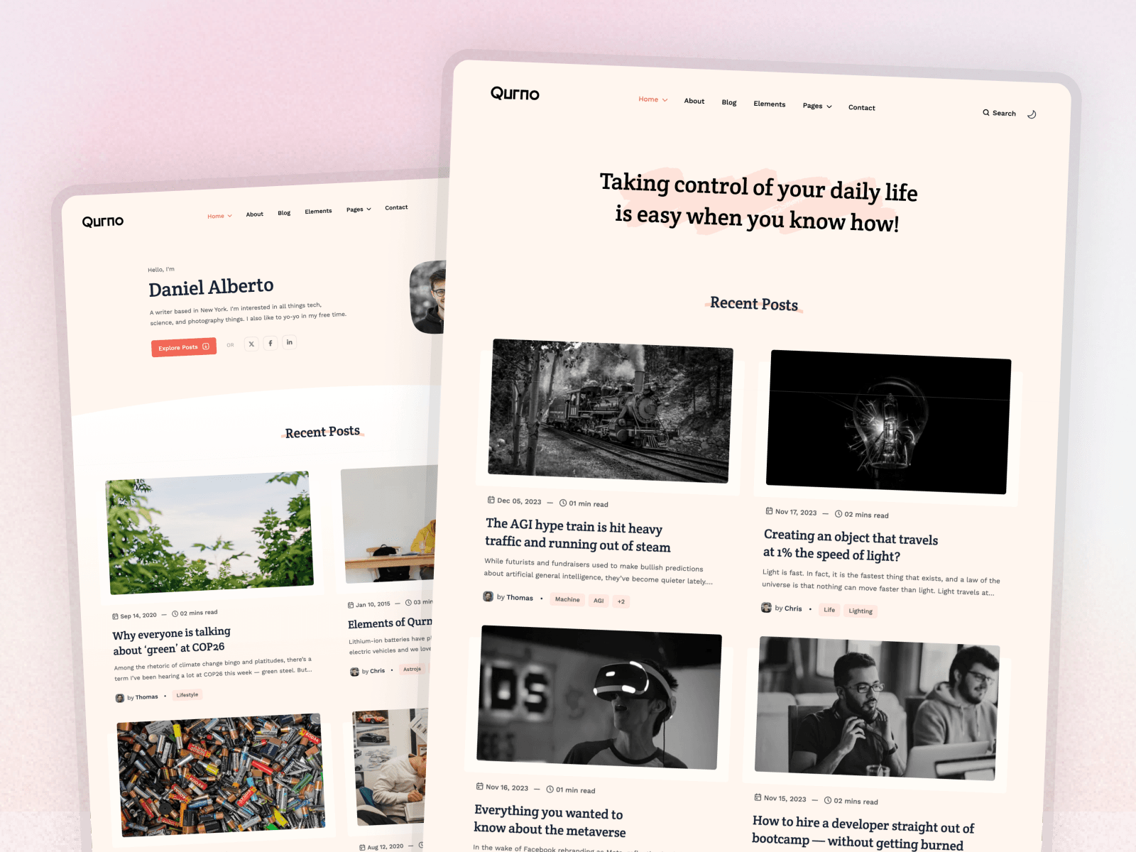
Every Platoltheme Astro theme is built on Astro v7 and Tailwind CSS v4 with the setup above already done: design tokens in CSS, optimized fonts, styled Markdown, and responsive layouts. Qurno, for example, ships with a dark and light mode switcher, and each theme's documentation explains exactly where to change colors and fonts.
Frequently Asked Questions
How do I install Tailwind CSS in Astro?
Run npx astro add tailwind. On Astro 5.2 and later it installs Tailwind CSS v4 with the official Vite plugin and creates src/styles/global.css containing @import "tailwindcss". Import that file in your layout and Tailwind classes work on every page that uses the layout.
Where is tailwind.config.js in Tailwind v4?
Tailwind CSS v4 is configured in CSS instead of a JavaScript file. Custom colors, fonts, and breakpoints go in an @theme block in your main stylesheet, and plugins are added with the @plugin directive.
How do I add dark mode to Astro with Tailwind?
Add @custom-variant dark (&:where(.dark, .dark *)); to your stylesheet so dark: utilities follow a class on the <html> element, add a small inline script in the head that sets the class from localStorage or the system preference, and add a button that toggles it.
How do I style Markdown posts with Tailwind?
Install @tailwindcss/typography, add @plugin "@tailwindcss/typography"; to your stylesheet, and wrap rendered Markdown in an element with the prose class. Add dark:prose-invert for dark mode.
Can I use the Tailwind v3 integration with Astro v7?
The old @astrojs/tailwind integration was built for Tailwind v3. New projects should use Tailwind v4 with the Vite plugin, which is what npx astro add tailwind installs on current Astro versions.
Conclusion
Tailwind CSS v4 and Astro fit together naturally: one command to install, design tokens in plain CSS, and utilities that compile away to a small stylesheet. Add the typography plugin for content and a class-based dark mode with an inline script, and you have a complete styling setup for any Astro site.
Next, learn how to manage your site's content with Astro content collections, or make sure it ranks with our Astro SEO guide.